Salathai Thai Cuisine
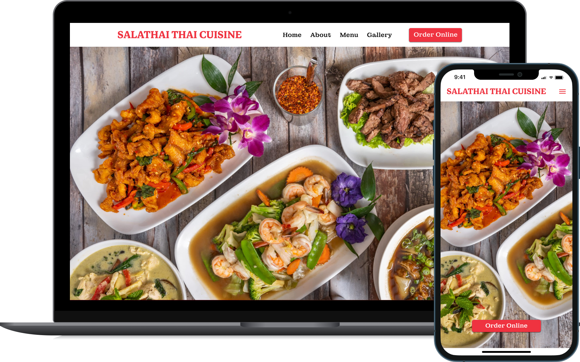
Designing a better responsive website for new and returning customers.
Role: UX Designer, Researcher
Project Overview
Background
Salathai Thai Cuisine is a family-owned restaurant located in the suburbs of L.A. featuring an extensive menu of authentic Thai dishes.
To remain relevant in a society with an ever increasing reliance on the internet, it is more important than ever for businesses to have a strong online presence. As competition for Asian cuisine increases in the area, Salathai is seeking a way to capitalize on the growing demand for online ordering while exploring a new avenue to attract new customers for in-person dining.
I was brought on by the owner to give a much needed update to the restaurant’s website.
Problem
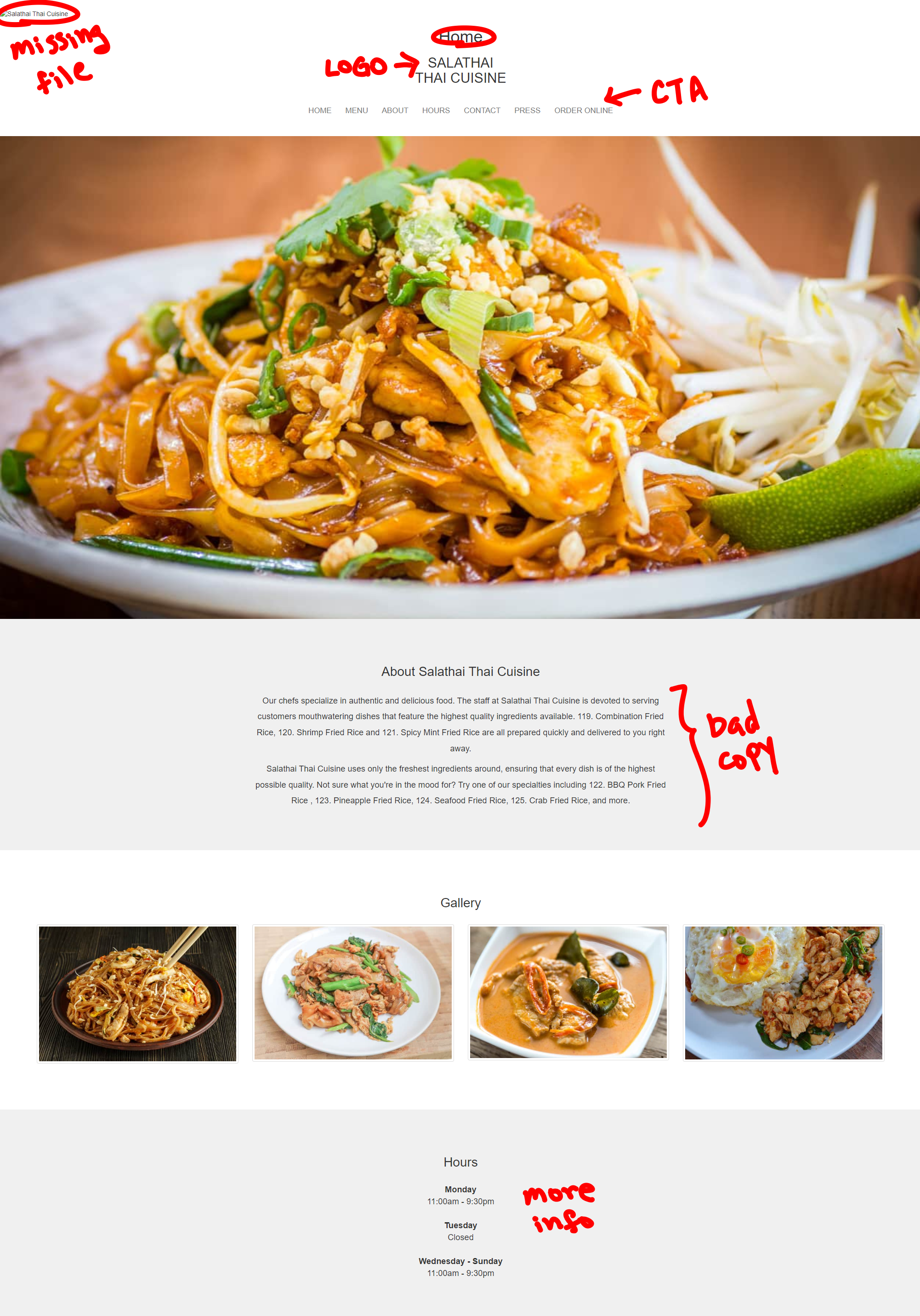
The current restaurant website is outdated and difficult to use. A quick inspection reveals problems such as missing image files, stale links, a low quality hero image, unclear call-to-action, confusing/unclear copy, and more. This is potentially causing the number of online orders to lag behind competitors and leaving potential customers hesitant to visit the restaurant in person.
Lack of previous branding materials, art assets/files, etc.
Owner wishes to continue using existing 3rd-party online ordering platform.
Challenges/Constraints
Scope
I focused on identifying problems with the existing website and finding ways to improve upon its design through research. I then used the research findings to redesign the restaurant homepage and inner pages.
Certain visual elements of the website were left with placeholders, as generating new visual assets (high-quality photographs, images, etc.) was outside the scope of the project. However, plans/recommendations for incorporating these materials in the future were provided. Implementation (coding) of the website was not done.
Solution
I designed a responsive website to give users a good experience from any device, whether they are at home or on the go. The new design focuses on:
Creating a clear call-to-action for online ordering
Showcasing the restaurant’s ambience and large selection of dishes
Improving overall usability and navigation
Foundational Research
Competitive Analysis
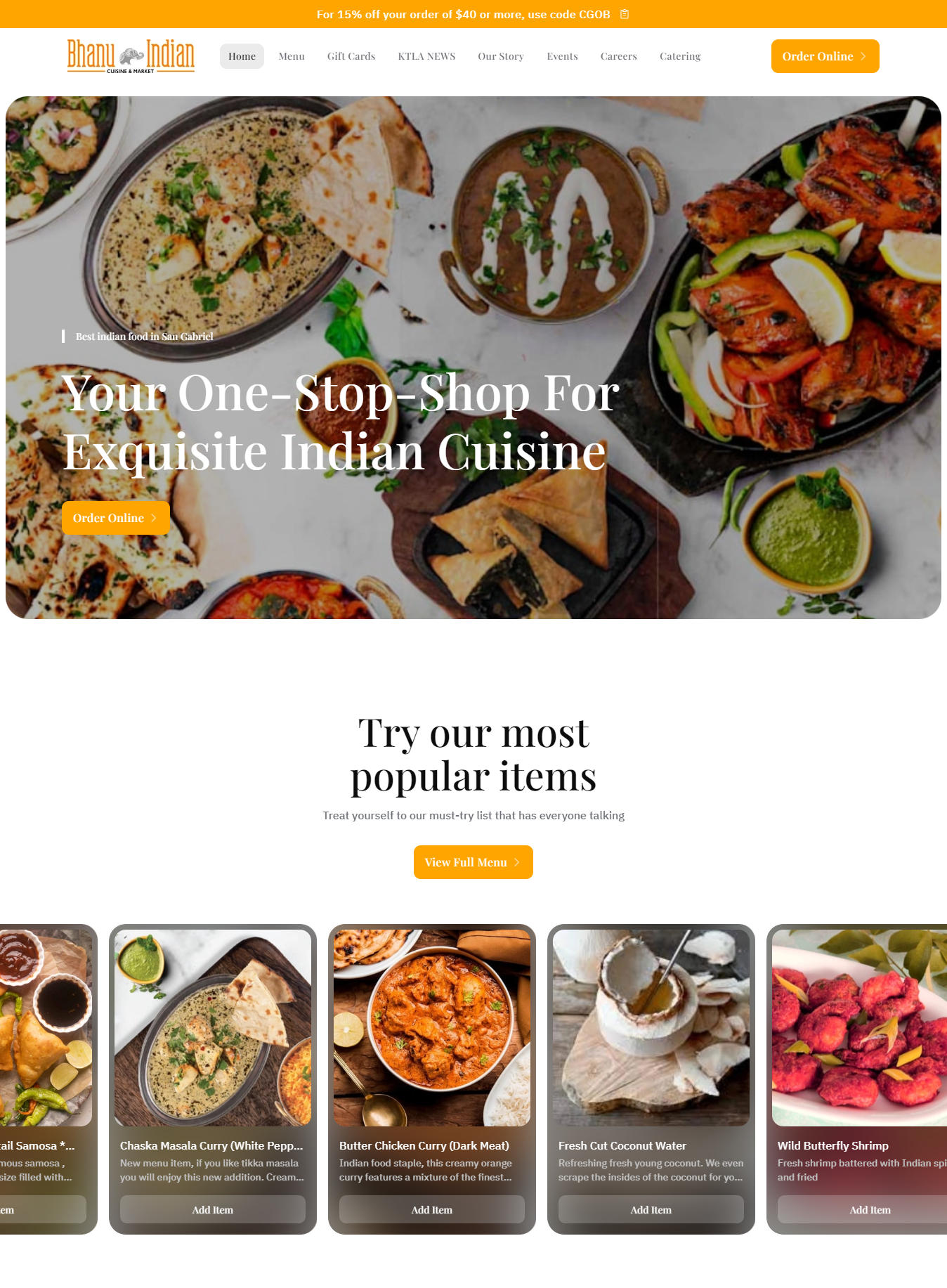
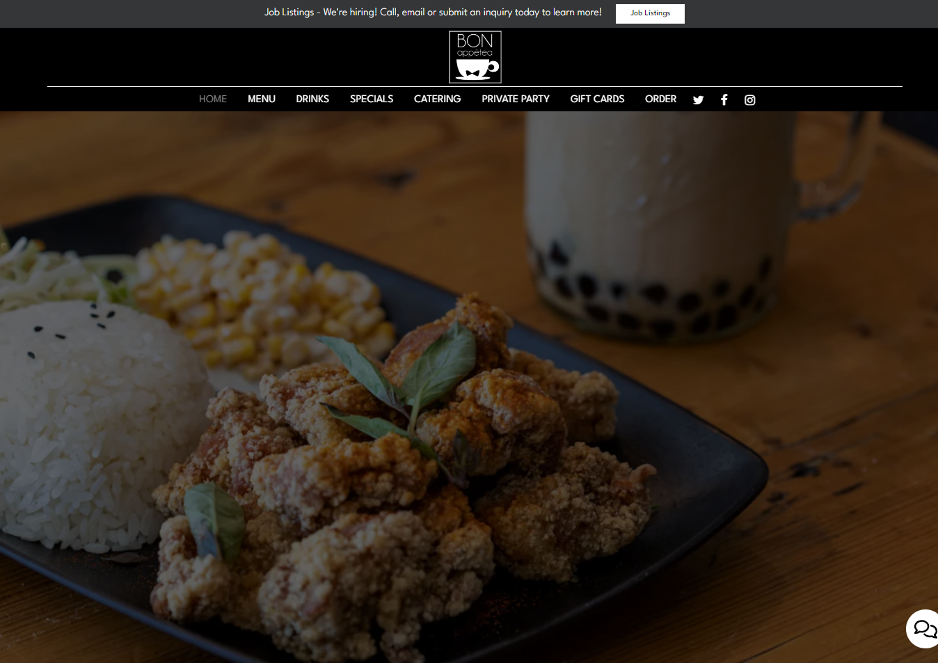
To understand how the current design compares to those of competitors, I conducted a competitive analysis of websites from 6 local restaurants. The websites were reviewed and rated based on their user experience, visual design, and written content. I was able to identify trends and common design patterns that are working for successful competitors.
User Interview
Next, I interviewed five current and potential customers. Participants ranged between ages 21 and 66, two of whom have been to the restaurant before. One participant is a student, three are employed, and one is retired.
“ I want to see what the restaurant looks like before going in person. ”
“ I won’t feel like going to a restaurant if the pictures on their website are pixelated. ”
“ If I already know what I want, I don’t want to waste time on the website. ”
“ I need a menu that shows which dishes are vegetarian. ”
Affinity Mapping
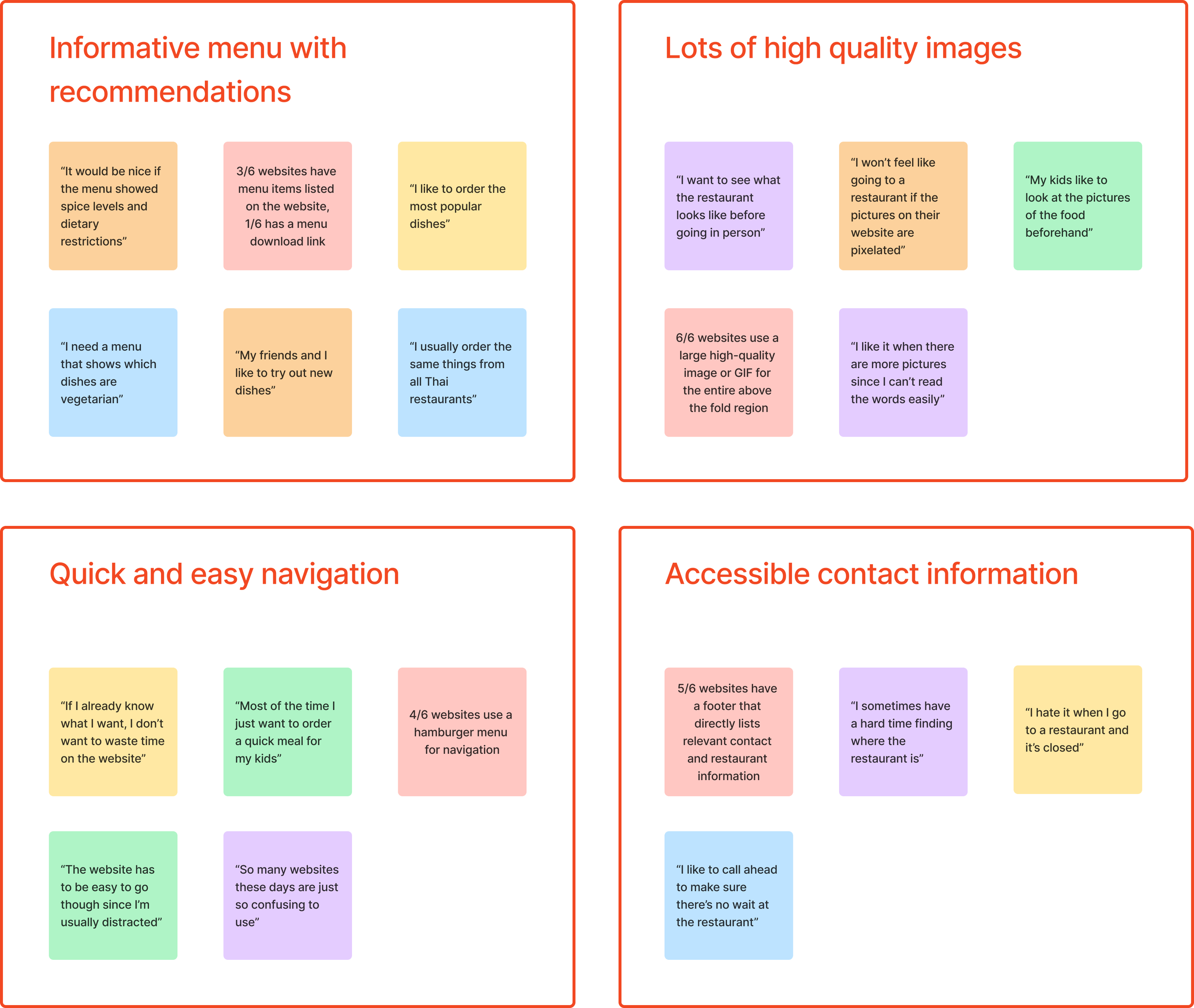
To synthesize research findings into actionable insights, I used an affinity diagram to organize and analyze the data.
Data points from both the competitive analysis and user interviews were grouped into themes, which helped to highlight common pain points users have with our existing website design and those those of competitors. The insights from these studies gave me clear goals for the website, and became the foundation for my user-centered design strategy.
User Personas
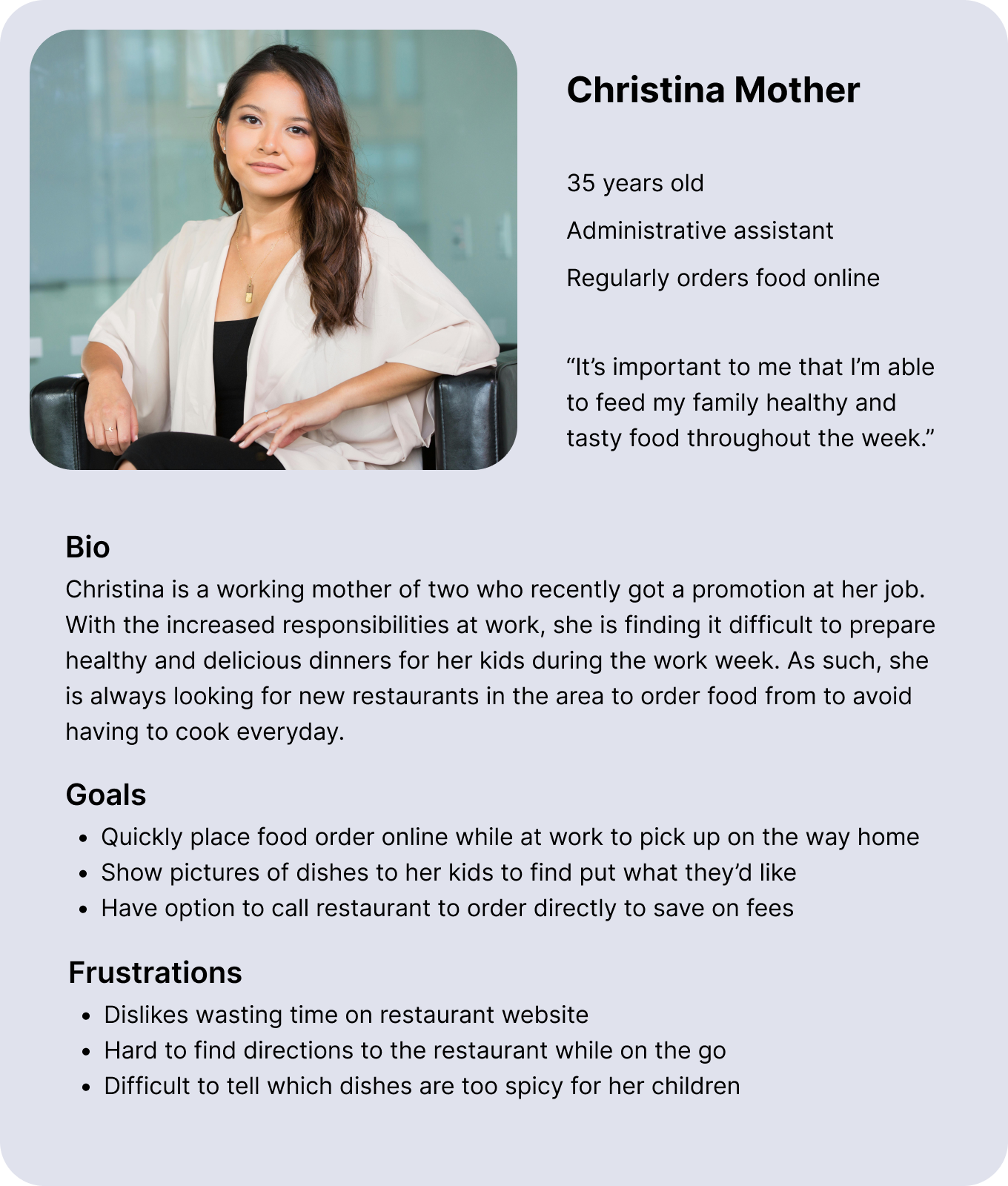
Using everything I learned from the research studies, I created two user personas in order to keep our target users front-and-center throughout the rest of the design process. Throughout the rest of the project, I frequently referenced these personas to ensure my designs meet the needs of potential users.
Early Designs
Information Architecture
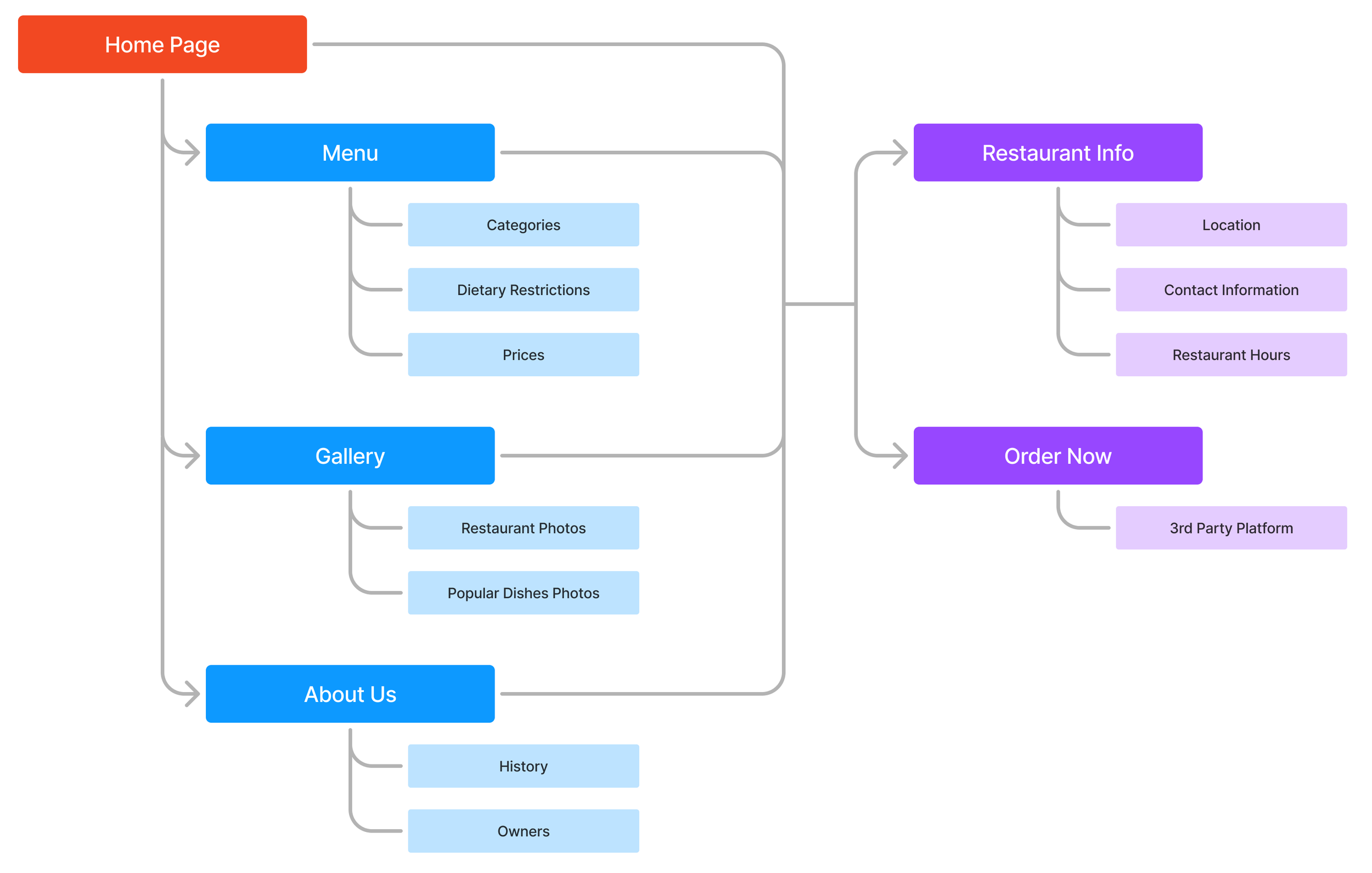
Before the first round of ideation, I created the information architecture for our website to organize all the content and functionalities to be included. Keeping my research insights in mind, I made sure users are able to access restaurant location/hours or transition to online ordering from anywhere in the website.
“Paper” Wireframes
To quickly explore lots of ideas, I digitally sketched a set of low fidelity wireframes for each of the pages listed in the information architecture. I made sure to consider (but not limiting myself to) market trends and research findings when drafting the first round of ideas. I then highlighted the design elements from each version that I’d like to bring to the next round of designs.
A progressive enhancement (bottom-up design) approach was chosen for the project, starting the design process from mobile devices. This was done to optimize the experience of mobile users, who make up the largest portion of website users. The finalized designs will later be adapted to fit larger screen sizes.
Lo-fi Prototype
I consolidated the best ideas into a set of low-fidelity digital wireframes, then added functionality for early prototyping.
Stakeholder Review
I sought feedback from stakeholders early and often to ensure my progress was aligned with project expectations. By starting the prototyping and testing process early, I was able to get valuable feedback about creative decisions and essential content for the website which helped to inform the rest of the design process.
Refining the Design
Style Guide
Before I moved to the high-fidelity designs, I wanted to create a style guide that would aid me during the design process and to ensure consistency throughout the product. Since no previous branding materials or guidelines were available to me for this project, I had to start from scratch.
The color palette was created from the colors on the flag of Thailand, adjusted slightly to ensure sufficient contrast in accordance with the Web Content Accessibility Guidelines. Montague Slab was chosen as the typeface for its above average width and x-height for legibility.
Hi-fi Mockups and Prototyping
Using the style guide as a reference, I created mockups based on the lo-fi wireframes and feedback from stakeholders. To best match the desired look and feel of the final product, I wrote all the necessary copy for the website and populated the site with a combination of images taken at the restaurant and placeholder stock photos. To prepare for testing, I then added interactivity to the mockups to create a functional prototype of the design.
Usability Study
To evaluate whether design goals have been achieved, the same 5 participants from the earlier user interviews were invited back to participate in a usability study. A combination of in-person and Zoom interviews were conducted, where participants were asked to perform a series of tasks using the hi-fi prototype. Metrics such as completion rate, time-on-task, and error rates were collected during the study, and participants were asked to rate and explain their experience with the tasks.
Task #1 :
From the homepage, locate the address, hours, and contact information for the restaurant.
How would you rate the difficulty of finding this information? (1 = very difficult, 10 = very easy)
Task #2 :
Navigate to the “About Us” section of the webpage. From there, start the process of placing an online order.
How would you rate the difficulty of navigating to the “About Us” section of the website? (1 = very difficult, 10 = very easy)
How would you rate the difficulty of starting an online order from the “About Us” section? (1 = very difficult, 10 = very easy)
Interview Questions:
Overall, how would you rate the difficulty of reading the various texts on the website? (1 = very difficult, 10 = very easy)
Describe your experience with the amount and use of images throughout the website.
You can navigate to the “About Us” section of the website through a button on the homepage or through the navigation menu on the top right of the screen. Which method did you prefer? Why?
How likely are you to visit the restaurant in-person? How likely are you to place an online order from the website? (1 = very unlikely, 10 = very likely)
Research Results and Insights
Overall, the usability study was very successful and informative. Each participant was able to complete the simulated tasks without intervention, showing that the navigation solutions for the website is viable across potential users. Testing also revealed areas where this design still falls short, which would be resolved in the next round of design.
Research Insights
Navigation is viable across different users
5/5 users were able to complete tasks without intervention.
Participants used both the homepage buttons and hamburger menu for navigation.
Primary call to action was clear and effective
Average time to click “Order Online” button from the homepage after being prompted was 11 seconds.
“Yeah [the task] was very easy, the button is very obvious.”
Users appreciate seeing recommended menu items, but found the lengthy menu overwhelming
“I liked seeing the popular dishes with big pictures. It makes deciding what to eat very easy.”
“Opening the menu for the first time was kind of scary since it’s so long.”
Most users responded positively to the abundant use of images throughout the website
4/5 users were happy about with the use of images. The last user thought the gallery section was “a bit busy.”
“Seeing pictures of the restaurant makes me feel welcomed to go eat there.”
Some users found text on the website to be too long and hard to read
2/5 users reported difficulties reading small text, especially when light-colored text appeared on dark backgrounds.
1/5 users felt that come copy on the website were too lengthy
Opportunities
Featured discounts and deals would further entice customers
Information about catering should be available
Images in the gallery should be better organized to avoid confusion
Button to return to the homepage should be more obvious
The Solution
Final Disign
I made further refinements on the mobile prototypes based on the feedback and insights from the usability study. This includes improvements to both the text legibility and the navigation UI for the website. I made sure to refer to user personas and stakeholder feedback during this last round of iteration in order to ensure both user and business needs are met.
To round out the progressive enhancement design process, I adapted the mobile designs to fit larger screen sizes. In particular, ensuring a good desktop experience was the focus at this stage as these make up the second largest portion of site visitors.
Conclusion and Reflection
This project was full of firsts, and I was able to learn so much by following the design process from beginning to end.
The most challenging part of the experience was leading the entire design process as a solo UX designer. I had to learn to juggle between conducting research, designing/prototyping, and communicating with stakeholders. Additionally, working on a real project taught me the importance of considering both the needs of the business and the needs of the users, which really broadened my perspective as a designer.
If I had more time and resources, I would conduct an additional round of usability study earlier in the design process to better inform the second iteration of designs. However, the limitations allowed me to hone my ability to make the most of what I’ve got, and made the overall experience all the more fulfilling.
Thank you for your time in reviewing this case study. Please feel free to reach out to me for more details about this project or if you have any questions about my design process.

